
And I found out they are amazing: when I shrink the browser window below 1000px, the red “Search” div disappears automatically. I installed an iPhone browser emulator and this is how it looks there:
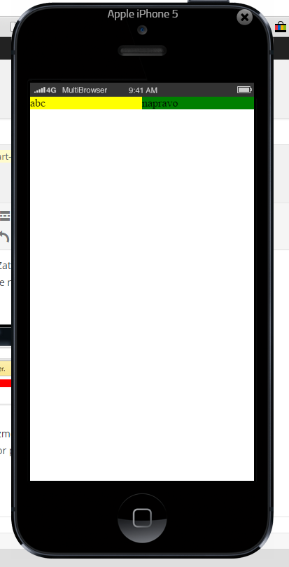
Interestingly, for device-height the iPhone works with the whole screen, including the browser controls, the toolbar and so on. But that does not bother me much, since in 99% of cases I will optimize the page for a certain width and not height (pages will stretch downwards anyway on displays with a lower resolution). Responsive web design consists of 3 basic components:
-
Flexible layout – I used this too, meaning I specified dimensions in %. It is a neat trick. -
Flexible images – I still have to learn how to work with these, but I think it will not be anything hard. -
Media Queries – this is what the beginning of this blog post is about.
You can read about the key basics on Wikipedia: https://cs.wikipedia.org/wiki/Responzivn%C3%AD_web_design . And now to the title itself. Until now I have built websites in ASP.NET + CSS + HTML + JS (either plain or compiled from TypeScript), and I was thinking about how to make my pages more dynamic and animated, and I wanted to kill two birds with one stone – if I am going to learn something new, then properly, from the ground up. That is why I decided my next website would be in PHP (which I will write in VS with the extension Microsoft shut down Visual Studio Gallery in 2018., which is paid, but I could probably afford some CZK 750 a year if I renew it every other year; still better than programming in anything other than VS).
So we will see whether I give up like with all my other attempts at PHP. Edit the day after: I have already quit PHP again, I hate Java-based IDEs and those PHP extensions are half-baked; it is almost like Linux, something is always broken :D.