The main Panels in Windows 10 Universal Apps can be used anywhere in your code. For more information, visit MSDN , which is where I got my information as well. Only the most basic ones are covered here; MSDN describes them in more detail.
Windows.UI.Xaml.Controls.RelativePanel
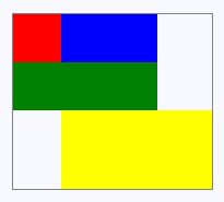
Inherits from Panel, nothing is derived from it. Defines an area within which you can position and align child objects in relation to each other or the parent panel. A panel that can position an element in any way relative to other elements. The code says more:
<RelativePanel BorderBrush="Gray" BorderThickness="1">
    <Rectangle x:Name="RedRectangle" Fill="Red" Height="44" Width="44"></Rectangle>
    <Rectangle x:Name="BlueRectangle" Fill="Blue" Height="44" Width="88" RelativePanel.RightOf="RedRectangle"></Rectangle>
    <Rectangle x:Name="GreenRectangle" Fill="Green" Height="44" RelativePanel.Below="RedRectangle" RelativePanel.AlignLeftWith="RedRectangle" RelativePanel.AlignRightWith="BlueRectangle"></Rectangle>
    <Rectangle Fill="Yellow" RelativePanel.Below="GreenRectangle" RelativePanel.AlignLeftWith="BlueRectangle" RelativePanel.AlignRightWithPanel="True" RelativePanel.AlignBottomWithPanel="True"></Rectangle>
</RelativePanel>
Windows.UI.Xaml.Controls.StackPanel
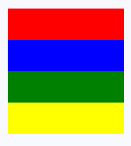
Inherits from Panel, nothing is derived from it. Arranges child elements into a single line that can be oriented horizontally or vertically. A Panel known since the first version of WPF – it simply stacks elements into a row or a column.
<StackPanel>
    <Rectangle Fill="Red" Height="44"></Rectangle>
    <Rectangle Fill="Blue" Height="44"></Rectangle>
    <Rectangle Fill="Green" Height="44"></Rectangle>
    <Rectangle Fill="Yellow" Height="44"></Rectangle>
</StackPanel>
Windows.UI.Xaml.Controls.Grid
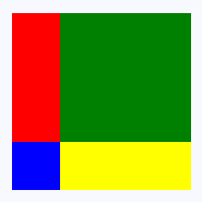
Inherits from Panel, SwapChainBackgroundPanel and SwapChainPanel are derived from it. Defines a flexible grid area that consists of columns and rows. Child elements of the Grid are measured and arranged according to their row/column assignments (set by using Grid.Row and Grid.Column attached properties) and other logic. Controls arranged into tables, where each row and column has:
- A proportional size/all the available free space
- An exact size
- A size just right for comfortable display (
Auto)
<Grid>
    <Grid.RowDefinitions>
        <RowDefinition></RowDefinition>
        <RowDefinition Height="44"></RowDefinition>
    </Grid.RowDefinitions>
    <Grid.ColumnDefinitions>
        <ColumnDefinition Width="Auto"></ColumnDefinition>
        <ColumnDefinition></ColumnDefinition>
    </Grid.ColumnDefinitions>
    <Rectangle Fill="Red" Width="44"></Rectangle>
    <Rectangle Fill="Blue" Grid.Row="1"></Rectangle>
    <Rectangle Fill="Green" Grid.Column="1"></Rectangle>
    <Rectangle Fill="Yellow" Grid.Row="1" Grid.Column="1"></Rectangle>
</Grid>
Windows.UI.Xaml.Controls.VariableSizedWrapGrid
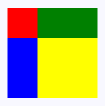
Inherits from Panel, nothing is derived from it. Provides a grid-style layout panel where each tile/cell can be variable size based on content. Its key property is MaximumRowsOrColumns. Let’s say we set it to 2 and insert 5 elements. The first row will contain 2, the second 2 and the third 1. If an element takes up more space in width/height, the other elements in that column/row will get the same available space as well. It is therefore similar to Grid, except that the width and height are always “Auto“. However, arranging into a grid takes precedence, which means it primarily tries to fill all the cells of the table. That is why the number of rows/columns may not always be what you specified.
<VariableSizedWrapGrid MaximumRowsOrColumns="3" ItemHeight="44" ItemWidth="44">
    <Rectangle Fill="Red"></Rectangle>
    <Rectangle Fill="Blue" VariableSizedWrapGrid.RowSpan="2"></Rectangle>
    <Rectangle Fill="Green" VariableSizedWrapGrid.ColumnSpan="2"></Rectangle>
    <Rectangle Fill="Yellow" VariableSizedWrapGrid.RowSpan="2" VariableSizedWrapGrid.ColumnSpan="2"></Rectangle>
</VariableSizedWrapGrid>
Windows.UI.Xaml.Controls.Canvas
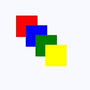
Inherits from Panel, LoopingSelectorPanel and PivotHeaderPanel are derived from it. Defines an area within which you can explicitly position child objects, using coordinates that are relative to the Canvas area. Another Panel control that never gets old. It displays elements at coordinates relative to its 0,0 point. They can overlap in various ways and have different z-index values set.
<Canvas Width="120" Height="120">
    <Rectangle Fill="Red" Height="44" Width="44"></Rectangle>
    <Rectangle Fill="Blue" Height="44" Width="44" Canvas.Left="20" Canvas.Top="20"></Rectangle>
    <Rectangle Fill="Green" Height="44" Width="44" Canvas.Left="40" Canvas.Top="40"></Rectangle>
    <Rectangle Fill="Yellow" Height="44" Width="44" Canvas.Left="60" Canvas.Top="60"></Rectangle>
</Canvas>
Can only be used in an ItemsControl template:
Windows.UI.Xaml.Controls.ItemsStackPanel
Inherits from Panel, the class is sealed. Arranges child elements into a single line that can be oriented horizontally or vertically. Supports pixel-based UI virtualization and grouped layouts. Can only be used to display items in an ItemsControl that shows multiple items; not supported for ComboBox and FlipView. Similar to VirtualizingStackPanel, it is suitable for a smaller number of items. The class name starts with “Items“, which means its content is not virtualized, unlike classes starting with “Virtualized“.
Windows.UI.Xaml.Controls.ItemsWrapGrid
Inherits from Panel, the class is sealed. Positions child elements sequentially from left to right or top to bottom. When elements extend beyond the container edge, elements are positioned in the next row or column. Supports pixel-based UI virtualization and grouped layouts. Can only be used to display items in an ItemsControl that shows multiple items; not supported for ComboBox and FlipView.
Windows.UI.Xaml.Controls.VirtualizingStackPanel
Inherits from OrientedVirtualizingPanel, the class is sealed. Arranges and virtualizes content on a single line that is oriented either horizontally or vertically. Can only be used to display items in an ItemsControl. Useful when you have a control with an ItemsPanel property that also displays a large number of items – when these items scroll off the screen, they are not destroyed, only their content changes, which is significantly faster and more efficient.
Windows.UI.Xaml.Controls.WrapGrid
Inherits from OrientedVirtualizingPanel, the class is sealed. Positions child elements sequentially from left to right or top to bottom. When elements extend beyond the container edge, elements are positioned in the next row or column. Can only be used to display items in an ItemsControl. Use it for ComboBox and FlipView elements, because the ItemsWrapGrid class does not support them.
For use in XAML code to create a completely new element from Panel
Windows.UI.Xaml.Controls.Primitives.CalendarPanel
Inherits from Panel, the class is sealed. Represents a panel that contains a calendar. As the MS developer documentation suggests, this is a panel that merely states that it contains a calendar. All the code, however, is up to you – you have to build the entire calendar from scratch.
DirectX panels
Windows.UI.Xaml.Controls.SwapChainBackgroundPanel
Inherits from Grid, nothing is derived from it. Implements a XAML layout surface target for Microsoft DirectX interoperation scenarios.
Windows.UI.Xaml.Controls.SwapChainPanel
Inherits from Grid, nothing is derived from it. Provides a hosting surface, where Microsoft DirectX swap chains provide content that can be rendered into a XAML UI. A SwapChainPanel element is a key component for an app that renders Microsoft DirectX graphics and then presents those visuals within a XAML page.
Base classes for other Panels
Windows.UI.Xaml.Controls.VirtualizingPanel
Inherits from VirtualizingPanel, CarouselPanel and OrientedVirtualizingPanel are derived from it. Provides a framework for Panel elements that virtualize their visual children.
Windows.UI.Xaml.Controls.Primitives.OrientedVirtualizingPanel
Inherits from VirtualizingPanel, VirtualizingStackPanel and WrapGrid are derived from it. Adds infrastructure (provides base class) for virtualizing layout containers that support spatial cues, such as VirtualizingStackPanel and WrapGrid.
For use only with specific elements
Windows.UI.Xaml.Controls.Primitives.CarouselPanel
Inherits from Panel, nothing is derived from it. Represents a panel that arranges its items in a line and circles around to the first item when the last item is reached. MSDN goes on to say:
CarouselPanel can’t be used as a stand-alone control, it can only be used as the
ItemsControl . It’s the default ItemsPanel for the
ComboBox control, and is not supported for use with any other ItemsControl . This means that CarouselPanel can be used only as a panel template and only in a ComboBox. With anything else, the app throws an exception “The Panel you are using for the Control is not allowed as an ItemsPanel for the Control.”
Windows.UI.Xaml.Controls.Primitives.LoopingSelectorPanel
Inherits from Panel, the class is sealed. A panel for positioning and arranging child LoopingSelector elements. LoopingSelector is a class that gives an app the ability to display a list of items that never ends – when the last item is reached, it smoothly moves on to the first item.
Windows.UI.Xaml.Controls.Primitives.PivotHeaderPanel
Inherits from Canvas, the class is sealed. Displays the header text of the items in a Pivot control. It handles displaying the tab text in the Pivot control.
Windows.UI.Xaml.Controls.Primitives.PivotPanel
Inherits from Panel, the class is sealed. Displays the items in a Pivot control. It displays the tab content in the Pivot control.