I had already been thinking a bit about how to redesign the BibleServer website, because once it becomes responsive, it would be awkward if users had to go back to the home page for every next action and click a link there for what they want to do next. So I set a clear course: I needed to add one more column, and for it I picked the Metro UI
Menu control, which I had never used anywhere before.
I added it, and I wanted the second div to stay centered at all times. In the end I managed it, although it is centered within the whole page, not within its own context. In my opinion it looks much nicer than before. 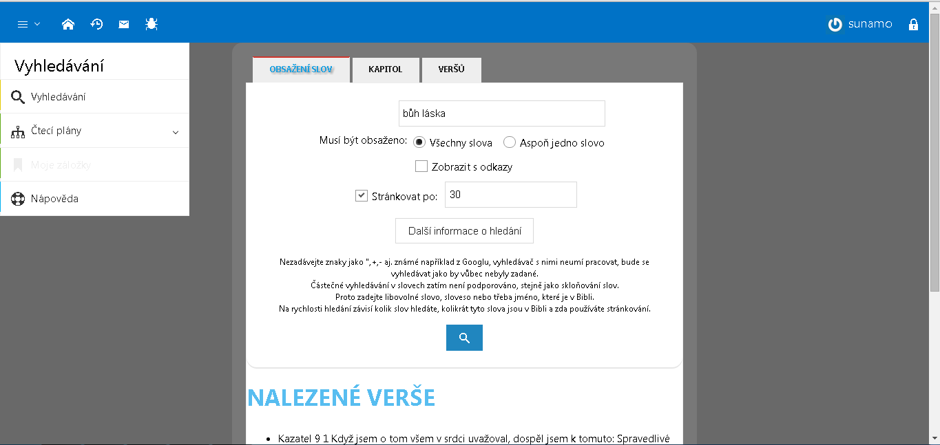
Specifically, what’s new:
- The various pages for searching the Bible have been merged into one – you switch between the different types of search in a tab control. All functionality has been preserved
- A new way of navigating – if you want to go from search to the reading plans, it is just one click in the navigation – no need to go to the home page.
- The third change concerns the CasdMladez website. There, the display of photos has been fixed, and all controls and graphics have been restyled using Metro Css Ui v3.